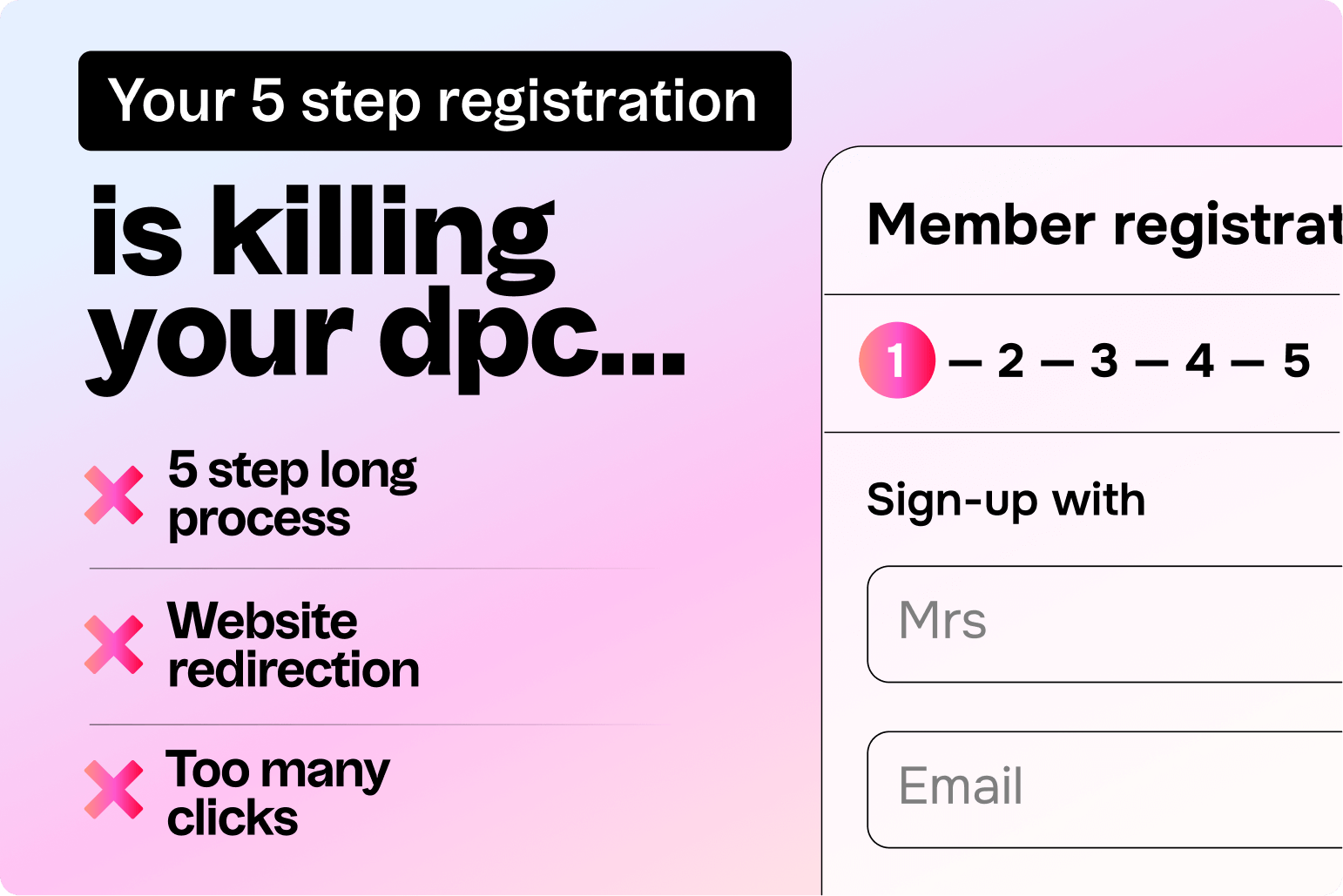
In Direct Primary Care (DPC), every click matters.
You spend months building trust with potential members — only to lose them at the final step: the signup.
Most DPC practices using form based member registration process e.g Hint, Google forms etc don’t realize they’re leaking conversions quietly — not because their offer is bad, but because the old-school form flow creates friction at every stage.
Let’s unpack where and why it happens — and how a simpler, smarter experience can fix it.
1. The “Five-Stage Form Trap”
-
Form based onboarding is built around a multi-step form — usually 4–5 stages (e.g Hint) before a patient can complete sign-up.
-
These stages include: personal info → plan selection → payment setup → agreement → confirmation.
-
Each step feels “corporate” — not human.
-
In real-world DPC, people drop off when it takes more than 2 steps to finish.
What happens:
-
30–40% of visitors quit by step 2 (especially on mobile).
-
Patients who are sick or anxious rarely push through five screens.
-
Each “Next” button becomes a small emotional exit door.
Real Example:
A DPC clinic in Colorado saw 2 out of 3 patients stop mid-signup when form based registration was used directly from the website. When they switched to a one-screen checkout + guided chat, completion rates jumped by 52%.
2. The “You’re on your own” problem
-
These 5 step form based registration systems lack the membership clarification layer — doesn’t explain your membership — it just lists it.
-
Patients land on a form that expects them to already understand your model, pricing, and benefits.
-
But most DPC-curious patients don’t yet get what DPC is.
They’re comparing you to traditional insurance or urgent care.
💡 So what happens:
They see “$80/month” and think:
“Wait, is this per visit? Is this insurance? What if I just need a one-time check?”
And since the form doesn’t answer — they bounce.
Your website might have those answers buried on an FAQ or About page, but these old school registration systems never surfaces them in context.
That separation between education and transaction causes silent leakage.
3. The Redirection Risk
-
When you use e.g Hint’s hosted signup link, it redirects visitors away from your website.
-
This feels small, but psychologically it’s huge:
-
The visual context changes.
-
The domain name changes.
-
The patient wonders: “Wait… am I still on the same clinic site?”
-
That half-second of doubt creates exit opportunities.
And on mobile, any page load delay = instant tab close.
📱 Fact:
In modern UX, a 3-second redirect delay increases drop-offs by up to 40%.
What’s worse: once users leave your site, you lose behavioral data — you can’t see where they stopped or why.
4. The “Too Much Thinking” Moment
Imagine this:
A patient lands on your site after searching “Affordable DPC near me.”
They’re tired, maybe unwell.
They see your Hint link → get redirected → face a long signup form → get asked for credit card → but still have doubts about what they’re signing for.
They close the tab.
You lose the lead.
That’s how friction feels from a patient’s eyes — not broken, just exhausting.
5. The Drop-Off Map (User Flow Breakdown)
| Stage | Friction Point | Why It Happens | Result |
|---|---|---|---|
| 1️⃣ Website → Hint ,Google Redirect | Domain + design change | Feels unfamiliar | Drop-off spike 20–30% |
| 2️⃣ Step 1 (Form Start) | Too many input fields | Patients feel it’s “signing insurance” | 10–15% leave |
| 3️⃣ Step 2–3 (Plan & Payment) | Pricing confusion, unclear benefits | Lack of inline education | 25–40% leave |
| 4️⃣ Step 4 (Agreement) | Legal language fatigue | No human tone, too formal | 10–15% leave |
| 5️⃣ Confirmation | No emotional close | Feels transactional, not welcoming | Lost excitement to complete |
Total estimated conversion loss = 40–60% potential members gone.
6. Why This Matters for DPC Clinics
-
Every DPC signup represents not just revenue, but trust.
-
If your checkout process feels cold or complicated, patients assume your care will feel the same.
-
Form based registration flow was built for compliance, not conversation — for admin safety, not emotional clarity.
Your patients want simplicity, reassurance, and human touch.
that some systems that makes them fill boxes.
7. The Future: Frictionless Membership Onboarding
Here’s what modern DPC onboarding should feel like:
-
One clear screen → “Join Now.”
-
Inline education explaining what they get for their membership.
-
Simple monthly price, transparent terms.
-
Option to “Call us before joining” for those needing human confirmation.
-
Smart reminders if they pause signup mid-way.
This turns a 5-step maze into a 1-step moment of trust.
In Short
Form based non guided registrations slows down momentum.
Redirection confuses trust.
Lack of inline education creates hesitation.
And long forms create drop-offs.
Your DPC signup should feel like joining a community — not filling an insurance form.
Final Thought
In a world where attention is thin and healthcare trust is fragile, friction kills curiosity.
Patients shouldn’t have to work hard to pay you.
If the signup takes too long, they’ll simply move on — even if you’re the perfect doctor for them.
Build a journey that feels like care — not paperwork.

